.svg)
Enhancing UGA Athena's User Experience
Redesigned user experience for Athena, UGA’s student information system

- Web Design
- Designer
- Researcher
- Prototyping
- Journey Mapping
- UX Design
- Figma
CATEGORY
ROLE
SKILLS
Role
As the sole designer, I was responsible for the entire process from researching, mapping, wireframing, and designing.
Overview
Athena, UGA’s student resource hub is a system that every student has to use throughout their time at UGA and has elicited complaints from students and faculty alike for its inadequacy and difficulty to navigate.
Most students only access Athena a few times a year, thus limiting their familiarity with the format of the system. This means that it’s important that the interface is one that is intuitive and streamlined to improve usability. Additionally, the instances when students do access Athena are often during critical moments, such as registering for classes, which can cause heightened anxiety and pressure. In such situations, students need a system that is not only user-friendly but also designed to reduce stress and support them in completing their tasks efficiently.
Problem
However, despite being updated in 2021, the current interface does not adequately address these challenges. As a result, students, such as myself, continue to face difficulties when using Athena, limiting our ability to navigate the system smoothly and without added frustration.
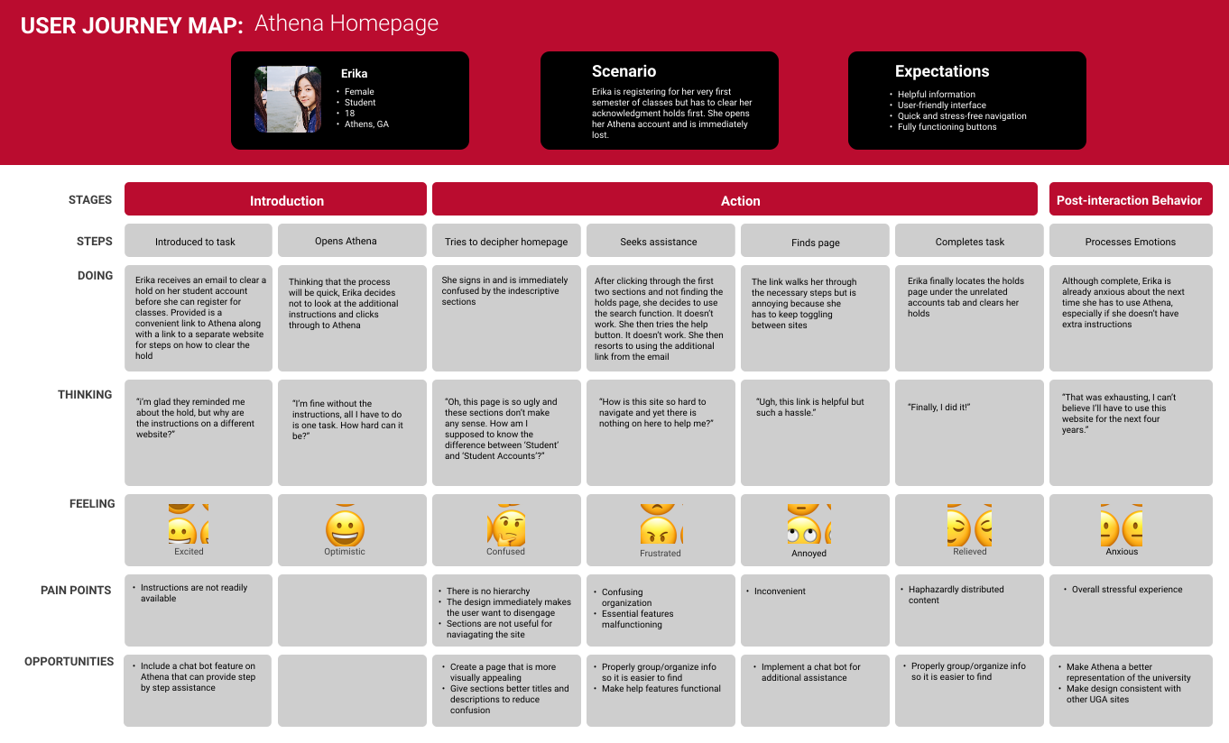
I created a user journey map, shown below, to outline the current experience a user has with completing one of the many tasks on Athena from beginning to end. The main pain points identified throughout the experience were:
- Lack of visual aesthetics and hierarchy (functioned more in an F pattern than a Z pattern)
- Confusing and undescriptive labeling of tasks and sections
- Content grouped under unrelated sections, making it difficult to quickly locate specific information
- Broken buttons and links
- Lack of readily available instructions or assistance
Solution
My goal of this prototyped redesign was to create a much more enjoyable experience, one that reduces users cognitive load (thank you Tragic Design) and enables them to quickly find what they need. I accomplished this in the following ways:
- Made the overall design more appealing and consistent with the design of other UGA sites to provide users an immediate sense of familiarity. I did so by following the UGA style guide, using only university approved images, icons, text, etc. and adhering to their strict implementation guidelines.
- Added a navigation bar with dropdown menus to provide transparency regarding the content of future pages and a functional site ID to allow seamless navigation back to the homepage.
- Regrouped items based on their similarities and placed them under more suitable section names.
- Provided descriptions for each link to serve as a preview of what to expect when clicked on.
- Implemented a chat bot as replacement for the “search” and “help” feature, providing users with immediate assistance. I also added a contact button for the instances when help from a real person is preferred.
Results
The result of this redesign is a much more fluid, intuitive, and attractive website. Navigation is effortless, allowing smooth transitions between pages, while the reorganized information enhances clarity and comprehension. Access to help is readily available through multiple formats, ensuring user convenience, and a sense of familiarity provides for a more enjoyable overall user experience.
Below is the finished prototype highlighting all updated general touchpoints while also following the path that our persona, Erika, would take to complete her customer journey.